Issue of the Week: Disease


Why the Pandemic Experts Failed, The Atlantic Magazine, March 15-22, 2021
Today is the Spring Equinox in the Northern Hemisphere, the Fall Equinox in the Southern Hemisphere.
It would be a good day to be optimistic–if only it were that simple. After a full year of the global covid pandemic, we should be eyeing the end over the horizon, and maybe we are. But it’s at best up in the air, pun intended, as we write.
Here in the North, especially global-hotspot-failure-central on the globe, the US, everything is in balance–between intelligent policy-making pushing a modicum of discipline and prudence while the increasingly widely available vaccines create herd immunity, and irrational policy-making playing to self-centered delusional behavior and vaccine hesitancy displaying herd stupidity.
Meanwhile, Europe may be headed back to hell, a potentially unthinkable déjà vu,
Continuing collapse in Brazil and upticks in transmission in places like India, which in population contains the US and Europe combined, remind that this is a global pandemic, which like all the pandemics of various sorts that afflict humanity and life on earth, can only be solved globally.
But if the still global leader in the main, the US, the place with more cases and deaths than anywhere else so far, as well as the place with the resources and know-how to most quickly in history create three effective vaccines already, does not succeed–then look out world.
So today, in an updated post (March 22), we bring you three articles from The Atlantic Magazine, Why the Pandemic Experts Failed, The Clearest Sign the Pandemic Could Get Worse and America Is Now in the Hands of the Vaccine-Hesitant.
They cover the reasons for pessimism and potential optimism in the US. And The Atlantic is uniquely positioned to cover this story. Their Covid Tracking Project, unknowingly, was providing the pandemic data for the government of the United States.
Here are the opening paragraphs from Why the Pandemic Experts Failed, surely among the most shocking words ever written, by Robinson Meyer and Alexis C. Madrigal:
A few minutes before midnight on March 4, 2020, the two of us emailed every U.S. state and the District of Columbia with a simple question: How many people have been tested in your state, total, for the coronavirus?
By then, about 150 people had been diagnosed with COVID-19 in the United States, and 11 had died of the disease. Yet the CDC had stopped publicly reporting the number of Americans tested for the virus. Without that piece of data, the tally of cases was impossible to interpret—were only a handful of people sick? Or had only a handful of people been tested? To our shock, we learned that very few Americans had been tested.
The consequences of this testing shortage, we realized, could be cataclysmic. A few days later, we founded the COVID Tracking Project at The Atlantic with Erin Kissane, an editor, and Jeff Hammerbacher, a data scientist. Every day last spring, the project’s volunteers collected coronavirus data for every U.S. state and territory. We assumed that the government had these data, and we hoped a small amount of reporting might prod it into publishing them.
Not until early May, when the CDC published its own deeply inadequate data dashboard, did we realize the depth of its ignorance. And when the White House reproduced one of our charts, it confirmed our fears: The government was using our data. For months, the American government had no idea how many people were sick with COVID-19, how many were lying in hospitals, or how many had died. And the COVID Tracking Project at The Atlantic, started as a temporary volunteer effort, had become a de facto source of pandemic data for the United States.
Here are the three articles from The Atlantic:
“Why the Pandemic Experts Failed”
By Robinson Meyer and Alexis C. Madrigal,
We’re still thinking about pandemic data in the wrong ways.
A few minutes before midnight on March 4, 2020, the two of us emailed every U.S. state and the District of Columbia with a simple question: How many people have been tested in your state, total, for the coronavirus?

The consequences of this testing shortage, we realized, could be cataclysmic. A few days later, we founded the COVID Tracking Project at The Atlantic with Erin Kissane, an editor, and Jeff Hammerbacher, a data scientist. Every day last spring, the project’s volunteers collected coronavirus data for every U.S. state and territory. We assumed that the government had these data, and we hoped a small amount of reporting might prod it into publishing them.
Not until early May, when the CDC published its own deeply inadequate data dashboard, did we realize the depth of its ignorance. And when the White House reproduced one of our charts, it confirmed our fears: The government was using our data. For months, the American government had no idea how many people were sick with COVID-19, how many were lying in hospitals, or how many had died. And the COVID Tracking Project at The Atlantic, started as a temporary volunteer effort, had become a de facto source of pandemic data for the United States.
After spending a year building one of the only U.S. pandemic-data sources, we have come to see the government’s initial failure here as the fault on which the entire catastrophe pivots. The government has made progress since May; it is finally able to track pandemic data. Yet some underlying failures remain unfixed. The same calamity could happen again.
Data might seem like an overly technical obsession, an oddly nerdy scapegoat on which to hang the deaths of half a million Americans. But data are how our leaders apprehend reality. In a sense, data are the federal government’s reality. As a gap opened between the data that leaders imagined should exist and the data that actually did exist, it swallowed the country’s pandemic planning and response.The COVID Tracking Project ultimately tallied more than 363 million tests, 28 million cases, and 515,148 deaths nationwide. It ended its daily data collection last week and will close this spring. Over the past year, we have learned much that, we hope, might prevent a project like ours from ever being needed again. We have learned that America’s public-health establishment is obsessed with data but curiously distant from them. We have learned how this establishment can fail to understand, or act on, what data it does have. We have learned how the process of producing pandemic data shapes how the pandemic itself is understood. And we have learned that these problems are not likely to be fixed by a change of administration or by a reinvigorated bureaucracy.That is because, as with so much else, President Donald Trump’s incompetence slowed the pandemic response, but did not define it. We have learned that the country’s systems largely worked as designed. Only by adopting different ways of thinking about data can we prevent another disaster:
1. All data are created; data never simply exist.
Before March 2020, the country had no shortage of pandemic-preparation plans. Many stressed the importance of data-driven decision making. Yet these plans largely assumed that detailed and reliable data would simply … exist. They were less concerned with how those data would actually be made.
So last March, when the government stopped releasing testing numbers, Nancy Messonnier, the CDC’s respiratory-disease chief, inadvertently hinted that the agency was not prepared to collect and standardize state-level information. “With more and more testing done at states,” she said, the agency’s numbers would no longer “be representative of the testing being done nationally.”
When we started compiling state-level data, we quickly discovered that testing was a mess. First, states could barely test anyone, because of issues with the CDC’s initial COVID-19 test kit and too-stringent rules about who could be tested. But even beyond those failures, confusion reigned. Data systems have to be aligned very precisely to produce detailed statistics. Yet in the U.S., many states create one sort of data for themselves and another, simpler feed to send to the federal government. Both numbers might be “correct” in some sense, but the lack of agreement within a state’s own numbers made interpreting national data extremely difficult.
The early work of the COVID Tracking Project was to understand those inconsistencies and adjust for them, so that every state’s data could be gathered in one place. Consider the serpentine journey that every piece of COVID-19 data takes. A COVID-19 test, for instance, starts as a molecular reaction in a vial or lab machine, then proceeds through several layers of human observation, keyboard entry, and private computer systems before reaching the government. The pipelines that lead to county, state, and federal databases can be arranged in many different ways. At the end of the process, you have a data set that looks standardized, but may actually not be.
Yet the federal pandemic response was built on the assumption that those data were fundamentally sound, and that they could be fed into highly tuned epidemiological models that could guide the response. Inside the government, the lack of data led to a sputtering response. “What CDC is not accounting for is that we have been flying blind for weeks with essentially no [testing],” Carter Mecher, a medical adviser at the Department of Veterans Affairs, wrote to an email list of federal officials on March 13. “The difference between models and real life is that with models we can set the parameters as if they are known. In real life, these parameters are as clear as mud.”
We now know that early case counts reflected only a small portion of the true number of cases. They were probably 10 or even 20 times too small, according to later academic studies. The government missed the initial explosion of COVID-19 cases because, despite its many plans to analyze data, it assumed that data would simply materialize.
2. Data are a photograph, not a window.
By late spring of last year, the COVID Tracking Project’s Peter Walker had developed a simple way to visualize the sweep of the pandemic—four bar charts, presented in a row, showing tests, cases, hospitalized patients, and deaths. This chart has since aired on dozens of local news stations, and has been used by state and federal officials to view COVID-19’s path over time.

The charts seem authoritative, comprehensive. Yet the work of producing these data has taught us that every metric represents a different moment in time. You aren’t really looking at the present when you look at these charts—you’re looking at four different snapshots of the past.
The COVID Tracking Project’s research, led by Kara Schechtman and Michal Mart, has found that the data travel “at different speeds.” Take case and test data—the two factors that go into the “test-positivity rates,” which officials have used to trigger lockdowns, reopenings, and other pandemic policy measures. Case numbers can move quickly; negative test results flow more slowly. Combine them, and the dates of tests and cases may not match up. Individual states can make adjustments for this kind of problem, but comparisons across states remain difficult. Worse, while negative test results lag, test-positivity rates will look higher than they actually are, keeping schools and businesses from reopening.
The death data are also shaped by reporting systems in ways that few people—even top officials—seemed to understand. Although the CDC estimates that the median death is reported to state authorities about 20 days after the person has actually died, a huge range exists. About a quarter of deaths are reported less than six days after they have occured; another 25 percent are reported more than 45 days after. And the lags are simply not constant, as the epidemiologist Jason Salemi has shown with Florida data. These reporting quirks make it very difficult to assess the death toll for an outbreak until many weeks after the surge has ebbed.
There are other invisible problems in the data. For one, we have no idea how many antigen tests have been conducted in the United States. A recent government document estimated that 4 million of these rapid tests are now being conducted a day—more than twice the number of slower, but more accurate, polymerase-chain-reaction, or PCR, tests. Yet states report nowhere near that volume of antigen tests. Tens of millions of tests are going unreported. Where are they happening? How many are coming out positive? No one has any idea.
The data set that we trust the most—and that we believe does not come with major questions—is the hospitalization data overseen by the Department of Health and Human Services. At this point, virtually every hospital in America is reporting to the department as required. We now have a good sense of how many patients are hospitalized with COVID-19 around the country.
This has allowed the federal government to target aid, deploying health-care personnel, medicine, and personal protective equipment to the hospitals that need it most—a clear example of how accurate pandemic data can help policy makers.
3. Data are just another type of information.
Data seem to have a preeminent claim on truth. Policy makers boast about data-driven decision making, and vow to “follow the science.” But we’ve spent a year elbow-deep in data. Trust us: Data are really nothing special.
Data are just a bunch of qualitative conclusions arranged in a countable way. Data-driven thinking isn’t necessarily more accurate than other forms of reasoning, and if you do not understand how data are made, their seams and scars, they might even be more likely to mislead you.
This problem has hampered the pandemic response from the start. By early March, it was evident that the virus should have been spreading in the U.S. Yet the CDC’s stringency about who could be tested and the lack of clear testing data meant many federal leaders simply didn’t acknowledge that reality.
Today, these issues somehow remain. In a press conference on March 1, 2021, the new CDC director, Rochelle Walensky, cautioned the public about new coronavirus variants. Cases and deaths were both rising nationwide, she warned, potentially implying that the mutated versions of the virus were to blame. But at the COVID Tracking Project, we knew this narrative of a variant-driven surge didn’t hold. If deaths were rising now, that meant cases had risen a month ago. This didn’t add up—a month earlier, cases had been falling, precipitously.
Instead, we knew from following the data closely that many states were reporting huge backlogs as they examined death certificates. At the same time, Texas and several other states had been crushed by a winter storm. This sent their reporting plummeting—deaths dipped faster than they should have, and then shot back up, when work fully resumed. Since Walensky spoke, the average number of deaths a day has fallen by almost 25 percent.
In other words, it wasn’t that the pandemic in those states had gotten worse in February, but that the peak straddling December and January had been even more damaging than we knew at the time. Public-health officials continue to believe that the data in front of them can be interpreted without sufficient consideration of the data-production process.
And so deep problems with the data persist. The COVID Tracking Project has shown that at least five states have disturbingly incomplete testing data. In some states, 80 percent of tests are missing from the equivalent federal data set. Yet the CDC is referring leaders of those states to its own test-positivity-rate data—which are calculated from these inaccurate data—when they consider reopening their schools.
Because of the painstaking labor of its more than 550 contributors, the COVID Tracking Project was among the first to identify virus surges in the Sun Belt and the Midwest; it determined the outsize importance of nursing homes in driving COVID-19 deaths; and it found widespread evidence of overwhelmed hospitals during the harsh winter surge. Our data have been used by The New York Times, Johns Hopkins University, and two presidential administrations.
Data are alluring. Looking at a chart or a spreadsheet, you might feel omniscient, like a sorcerer peering into a crystal ball. But the truth is that you’re much closer to a sanitation worker watching city sewers empty into a wastewater-treatment plant. Sure, you might learn over time which sewers are particularly smelly and which ones reach the plant before the others—but you shouldn’t delude yourself about what’s in the water.
The scientists at the CDC clearly have far more expertise in infectious-disease containment than almost anyone at the COVID Tracking Project or The Atlantic. But we did spend a year grappling with the limitations of the system that Walensky and President Joe Biden now depend on. Perhaps no official or expert wants to believe that the United States could struggle at something as seemingly basic as collecting statistics about a national emergency. Yet at the COVID Tracking Project, we never had the luxury of that illusion. We started with a simple mission—to count tests nationwide—and, in pursuing it, immediately found ourselves enmeshed in the problems of defining and standardizing tests, cases, hospitalizations, and deaths. In the cracks of federalism, where the state and national governments grate against each other, we found alarming levels of chaos, but lurking within the chaos was the truth. We saw, in that dark place, how our public-health systems actually worked, not how we wished they would.
To avoid another data calamity, our public-health system must expend as much energy on understanding the present as it does on modeling the future. Governing through a pandemic—or any emergency—is about making the least-bad decisions with the best information available. That information can take many forms; it doesn’t have to be data. But if you do look at the data, then you must understand how each point, each cell, was made; otherwise, you’re likely to be misled.Our leaders should also put some faith in the capabilities of those whom they govern. The COVID Tracking Project clung to one principle: We told people the truth as we could discern it. We didn’t say what we wanted to be true, nor what we hoped would engender a specific public response.Working on the COVID Tracking Project has been the honor of our lives. For a year, every day, dozens of volunteers—programmers, librarians, high schoolers, a former hotel manager—came together to make an honest account of one of the most horrifying ordeals that any of us had ever experienced. This team of former strangers, united by concern and curiosity, salvaged something useful from the din. We held fast to one another, and we made sense of the world as we could.
ROBINSON MEYER is a staff writer at The Atlantic. He is the author of the newsletter The Weekly Planet, and a co-founder of the COVID Tracking Project at The Atlantic.
ALEXIS C. MADRIGAL is a staff writer at The Atlantic, a co-founder of the COVID Tracking Project, and the author of Powering the Dream: The History and Promise of Green Technology.
. . .
“The Clearest Sign the Pandemic Could Get Worse”
The Covid Tracking Project, March 18, 2021
Another coronavirus outbreak is unfolding in Michigan.

The number of people hospitalized with a confirmed case of COVID-19 in the United States has been plummeting since early January. Until about three weeks ago, hospitalizations in Michigan were following the same pattern: More people with COVID-19 were leaving the hospital than were being admitted. But in the past few weeks, data from the CDC and the Department of Health and Human Services have shown that hospitalizations have risen by 45 percent from the state’s recent low on February 25. According to federal data, among U.S. metropolitan areas with more than 1 million people, the Detroit area now ranks fourth in hospital admissions—and first in a metric that combines increases in test positivity and cases.
Throughout the fall and winter, we saw a clear pattern—cases would rise, then hospitalizations about a week later, and finally, two weeks after that, deaths would follow. Nursing homes and other long-term-care facilities reported particularly heavy death tolls. If Michigan were to continue that pattern, we would expect hospitalizations to keep rising, and then more deaths.
gan were following the same pattern: More people with COVID-19 were leaving the hospital than were being admitted. But in the past few weeks, data from the CDC and the Department of Health and Human Services have shown that hospitalizations have risen by 45 percent from the state’s recent low on February 25. According to federal data, among U.S. metropolitan areas with more than 1 million people, the Detroit area now ranks fourth in hospital admissions—and first in a metric that combines increases in test positivity and cases.
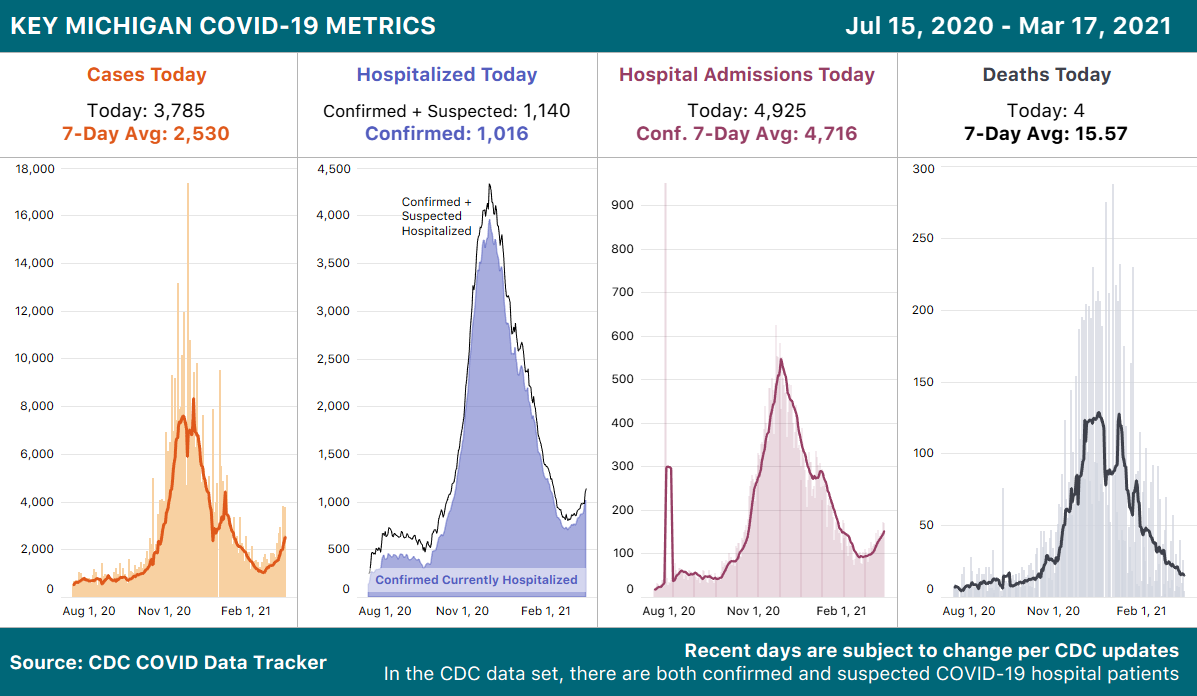
Throughout the fall and winter, we saw a clear pattern—cases would rise, then hospitalizations about a week later, and finally, two weeks after that, deaths would follow. Nursing homes and other long-term-care facilities reported particularly heavy death tolls. If Michigan were to continue that pattern, we would expect hospitalizations to keep rising, and then more deaths.
But as a spring surge takes hold in Michigan, two new factors—variants of concern and rising vaccination levels—mean that we don’t yet know how this new rise in cases and hospitalizations will play out.
The vaccination of people 65 and older and of nursing-home residents should blunt the death toll of a rise in cases. But according to state data, Michigan has administered first doses to 61 percent of its residents aged 65–74, and 62 percent of residents 75 and older. Detroit’s figures are much lower: The city has given first doses to only 43 percent of those aged 65–74 and 39 percent of people 75 and older. For comparison, the CDC reports that 66 percent of the U.S. population aged 65 and up has received at least one dose of vaccine. The numbers are even worse for Black people in Michigan: Statewide, just 28 percent of Black residents 65 and older are known to have received at least one dose of vaccine. Overall, Michigan has administered first doses to only about a quarter of its total population, and that number falls to 15 percent in Detroit.
The reality of vaccinations in nursing homes remains difficult to understand. The CDC reports that about 182,000 people in nursing homes and other long-term-care facilities have been vaccinated in Michigan through the Federal Pharmacy Partnership, but doesn’t separate resident and staff doses at the state level, making it impossible to derive a percentage of facility residents who have been immunized. According to the Michigan Department of Health and Human Services, COVID-19 cases and deaths in the state’s long-term-care facilities have declined substantially through February and March, and we can hope that this decline holds even as cases and outbreaks emerge around these facilities.
As Michigan’s numbers go back up, the obvious next question is to what degree variants of concern are playing a role in this localized surge. Genomic surveillance remains limited in the United States, but from the numbers we do have, it seems as though the variant known as B.1.1.7, first identified in the U.K., is quite widespread in Michigan. In fact, according to the CDC’s tracking, the state of Michigan has the second-most confirmed cases of B.1.1.7 after Florida, despite having less than half the number of residents.
Although Michigan’s numbers indisputably show a resurgence of COVID-19, there are troubling signs in other parts of the country. Federal data show that per-capita hospitalizations in the New York area have remained among the highest in the nation. Unlike many other areas of the country, where hospitalizations have fallen close to pre-surge levels, in New York and New Jersey hospitalizations have plateaued for weeks, according to federal data. We are not yet seeing huge upticks, but it’s not a good sign that as many people are being admitted to hospitals as are leaving them.
In months past, we might have been able to make educated guesses about what might happen next as the situation worsens in Detroit: We would expect to see cases and hospitalizations increase statewide and also rise elsewhere in the region, as when the Dakotas and Wisconsin acted as sentinels for the deadly third surge of cases over the winter. We would also have seen deaths soar several weeks after cases rose, especially within nursing homes. But Michigan’s surge arrives in a national landscape altered by new viral variants and more than 100 million immune systems strengthened by vaccination. We anticipate that state and federal vaccination efforts will increase in and around Detroit—and across the country—fast enough to prevent a regional or national reversal of our hard-won progress. What the numbers incontrovertibly show, however, is that we’re not going to see COVID-19 immediately disappear. As public-health experts have suggested for months, there will be continuing outbreaks this spring—likely as a result of B.1.1.7 becoming the dominant virus. Now the question is how bad they’ll get and how far they’ll spread.
Alexis C. Madrigal, Dave Luo, Peter Walker, Erin Kissane, Jessica Malaty Rivera, and Conor Kelly contributed to this article.
THE COVID TRACKING PROJECT is a volunteer organization launched from The Atlantic and dedicated to collecting and publishing the data required to understand the COVID-19 outbreak in the United States.
. . .
Daniel Engber, March 22, 2021
A subset of Americans haven’t yet made up their mind about getting a COVID-19 shot. Whether they turn out in the coming weeks will determine the future of the pandemic.

Next we must confront a more pernicious problem than one of mere logistics: There’s plenty of supply, but what about demand? The worry that significant numbers of Americans might end up refusing a safe, effective, and available COVID-19 vaccine has been salient from the start: Just a few months into the pandemic, pollsters warned that less than half of American adults were sure to take one. But as long as these vaccines were either in development or scarce, this was a hypothetical scenario. Now, at last, our hesitancy will be tested.
The outlook, at the moment, is mixed. Americans’ overall acceptance of the vaccines seems to have increased in recent months, as some of those who said in 2020 that they’d wait and see have now waited, seen, and drifted into yes. When you consider all the polls together, about 60 percent of Americans are apparently planning to be immunized, if they haven’t been already. But the remainder—a roughly even split of refuseniks and the undecided—isn’t shrinking at the rate we might have hoped.
I say that this is a funny fact about vaccines because one can find it equally consoling and alarming. It’s nice to know that the rise of Andrew Wakefield—whose (since retracted) research linking the MMR vaccine to autism spawned a generation of anti-vaccine activists—caused only a tiny divot in measles-vaccination rates in the U.S. It’s less reassuring that all the righteous work that followed—from anti-anti–vaccination groups on social media, from state legislators, and from many others—hasn’t done that much to move the baseline either.
It’s altogether possible—maybe even likely—that Americans’ attitudes toward COVID-19 vaccines are stuck in the same molasses. It’s true that certain periodic polls in recent months have shown a shift toward more acceptance. But polls with longer trails of data, the ones that started before the fall, suggest a different story: They show a dip in vaccine confidence as the election neared, which has since leveled out. Case in point: Gallup had yes at 66 percent in July, which slipped down to 50 percent at the end of September, and then bounced back to 71 percent in January.
That autumn fade makes sense, given what occurred in the lead-up to Election Day. Trump had promised to deliver a vaccine just in time for voting, and said that he was “rushing it” along. As that deadline neared, his administration all but went to waragainst the “deep state” actors at the FDA, installing hacks and hall monitors along the way. On October 7, in a televised vice-presidential debate, Kamala Harris told the nation, “If the doctors tell us that we should take [the vaccine], I’ll be the first in line … But if Donald Trump tells us that we should take it, I’m not taking it.”
Naturally, Americans’ faith in any future COVID-19 vaccine went into a slide. Public-health experts warned (against the evidence, as they often do) that this loss of confidence would be long-lasting and profound. But the polling shows that it wasn’t. The dangerous “fever of distrust,” as Ezekiel Emanuel described it, didn’t last much longer than the fall foliage: By midwinter, the polling numbers had returned to roughly what they’d been.
The same pattern applies to the partisan split about vaccines. The gap between Trump and Biden voters has widened in the past few months, but it may not be any bigger today than it was last summer. When the Trump administration signaled a willingness to mess with the FDA’s decision making, Democrats panicked most. As the election approached, their vaccine enthusiasm collapsed to the levels seen among Republicans. Gallup had the spread between the two groups at 37 points in July, four in September, and then 40 in January.
All of which is to say that COVID-19-vaccine attitudes right now are not that far off from where they started back in 2020, and any hopeful signs of movement in the past few months could be nothing more than bounce-back from the fall.
Vaccine-acceptance rates are typically stagnant, but that doesn’t mean they’re stuck in place. It’s often said that more people would get their flu shots if they only grasped the toll of the disease. The deaths caused by influenza—tens of thousands in the U.S. every year—are usually invisible, so much so that the risk is misperceived. For COVID-19, though, the cost is counted every day. When it nears a big, round number—10,000, or 100,000, or 200,000, or 400,000, or half a million—front-page headlines follow. This transparency alone might sway the vaccine-hesitant. So too could the thought of returning to a semblance of one’s former life. Get a COVID-19 vaccine, and you can hug your parents: No other vaccination has this perk.
As distribution centers open up to all adults, and more people get their shots, even just the idea of getting immunized could spread through social networks as its own happy contagion, bringing up acceptance rates. “The thing that works best for getting vaccinated is that it gets normalized,” says Maya Goldenberg, a philosopher of science at the University of Guelph, in Ontario, Canada, and the author of a new book, Vaccine Hesitancy: Public Trust, Expertise, and the War on Science. “When vaccination becomes the norm, most people will do it unless they have a really strong inclination not to.”
Read: A quite possibly wonderful summer
What might that mean in practice? At the moment, one-fourth of all adults have already gotten at least one dose of their vaccine. Another 35 to 40 percent say they plan to get vaccinated as soon as they can, and about 20 percent are now at maybe. Goldenberg told me that we shouldn’t think of this latter group as being truly undecided. “We know that a lot of people are saying ‘I want to get it, but I don’t want to be first in line.’ Does that count as vaccine-hesitant? I’m inclined to say no.” So even if the nevers never budge, it’s certainly possible that in the next few months, amid the vaccination saturnalia, nearly all the nation’s maybes will come around. In that case, we’ll end up with 80 percent of all adults having their vaccination cards filled out or making their appointments—right in Fauci’s sweet spot for herd immunity.
Of course, another problem should be considered here: It’s one thing to say you wantto get vaccinated, and another thing to do it. (SARS-CoV-2 antibodies, as the saying goes, don’t care about your feelings.) Past research shows that the pipeline from vaccine intentions to behavior can be somewhat leaky. Consider our efforts to address the previous pandemic, of the H1N1 swine flu in 2009. Then, as now, Americans varied widely in their estimations of the disease’s severity, and in how much they trusted the vaccine: A Pew Research poll conducted that October found that 64 percent of Democrats were ready to be immunized, compared with 43 percent of Republicans, and overall, half of American adults said that they planned to get the shot. By June 2010, only 27 percent said they’d actually done so. A somewhat milder attrition rate has been identified in small-scale research. Two very modest flu-shot studies, conducted at Rutgers University and among health-care workers in the Netherlands, compared vaccine intentions to behavior and found that about one-quarter of people who say they plan to be immunized fail to follow through. For the sake of argument, if we apply that rate to all the people who now say they’re yes or maybe on the COVID-19 vaccine, and then add the rest to the group of people who have gotten it already, the total coverage would come out to roughly 65 percent.
That projection lands us close to where we’ve been for flu vaccines among the nation’s seniors. That makes a certain amount of sense: Daniel Salmon, the director of the Institute for Vaccine Safety at Johns Hopkins Bloomberg School of Public Health, told me that he’s seen overlapping attitudes toward flu shots and the COVID-19 vaccine, both in surveys and in community meetings. The reasons people give for being wary are the same: They’re worried about adverse effects, he said, and don’t trust the government. Salmon’s team has also found that people are much more likely to say they’ll get the COVID-19 vaccine in 2021 if they’ve had a flu shot in the past.Flu-shot rates did go up this year, at least a bit: For the 2020–21 season, coveragereached 82 percent for seniors, up by almost seven points from the year before. But even those gently boosted numbers would be dire for the COVID-19 vaccine. “We need 70 to 80 percent of people to be immune, homogeneous throughout the population,” Salmon told me. Kids younger than 16 aren’t eligible for COVID-19 vaccination (at least for now), so that means coverage must be even higher for adults in order for the country to reach that threshold. “I’m worried that we’re going to make a dent in disease transmission,” Salmon said, “but that it won’t be enough.”Soon we’ll have a surplus of injections, and then a dearth of upper arms. If the maybes don’t turn out en masse—if in the coming months they fail to make their way to yes—there won’t be any simple finish to this crisis. Without their votes for vaccination, a miserable uncertainty will linger. Deaths could reach their next round headline number. The polls are opening across America. It’s time to watch the needle.
DANIEL ENGBER is a senior editor at The Atlantic.